Change warn and alert colours for customer facing screens
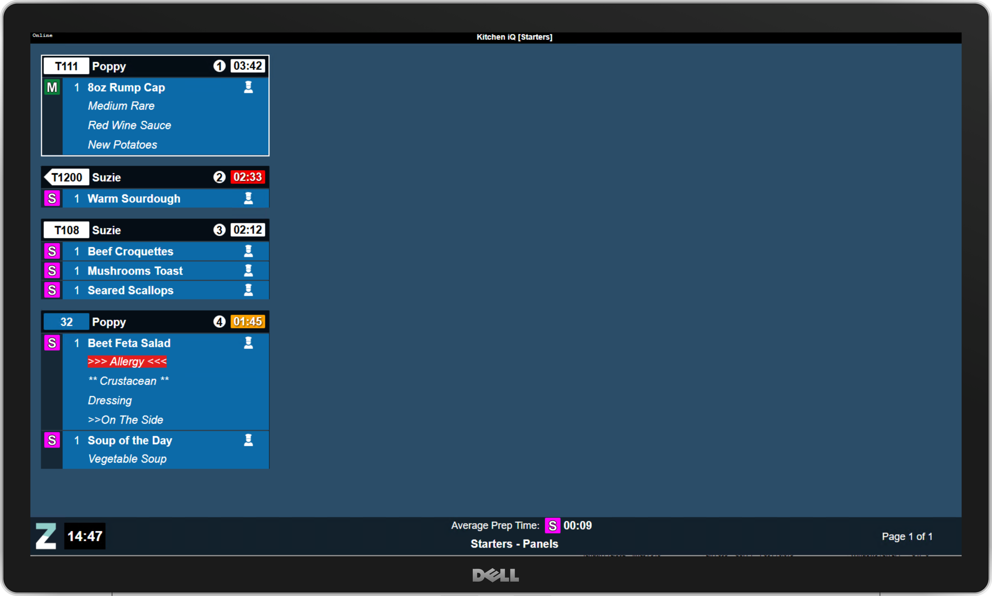
If you have customer-facing screens or an open-plan kitchen, displaying the default red and amber colours for warnings and alerts may not be ideal, as they could give guests the impression that there's an issue.
Choosing colours that don't signal danger or problems can influence how information is perceived. Opting for alternative colours that convey meaning internally while creating a more neutral or positive impression for guests can help set the right tone.
How do I configure this?
-
Scroll to the Other Settings section
-
Update the colours for
-
Warn Timer Colour (default orange)
-
Alert Time Colour (default red)
-
-
Click Save
An alternative approach if you want to keep the standard colours is to disable showing the warn and alert on specific channels which might be seen by guests.
-
Select a channel
-
Set the check box for
-
Disable Warn Display
-
Disable Alert Display
When disabled timers will not display with any highlighting -
-
Click Save